
Nostalgia
I associate the 1970s with listening to Simon and Garfunkel, Lou Reed, and the likes while sitting in the backseat of my mom’s 80’s Volvo as she drove my sister and me around town. It also brought me back to time spent with the women in my family, sharing generations of womanhood with my grandma, aunts, mom and sister.
Trends, to do them or not?
In 2022, Groovy-style ’70s florals started flooding my social media feeds, reminiscent of my aunt's retro kitchen wallpaper. These themes gained appeal in the marketplace and despite my nostalgia, the revival of this trend didn't speak to me. Was this trend passing through or here to stay? Should I go mainstream or niche? How could I authentically approach this trend if I wasn’t feeling it? I was at a loss and struggled with it. Telling myself I didn’t have to do it freed me, resulting in a perspective shift that made me want to pursue it after all.

Authenticity
Some of my home decor designs were already using 70s colors like midnight blue or vibrant gold so color didn’t seem like a stretch. I already loved vintage and retro was simply a descendant, sharing a nostalgia. The line work as a design attribute was intriguing but I didn’t love the uniform, mechanical vector-like quality so I approached it with watercolor and painterly linework.
In 2019, I created Darlene Ditsy Floral - (seen above) a retro print slightly before its time but something that called to my design sensibilities. I couldn’t have predicted how well this design would do. It turned out that this era did speak to me but I simply had to contend with my approach.
Research
Reading some articles on the nuances of the 1970s revival gave me a better understanding of the trends in context. As mentioned in this article, these colors had already been around for a while so they weren’t coming out of nowhere.
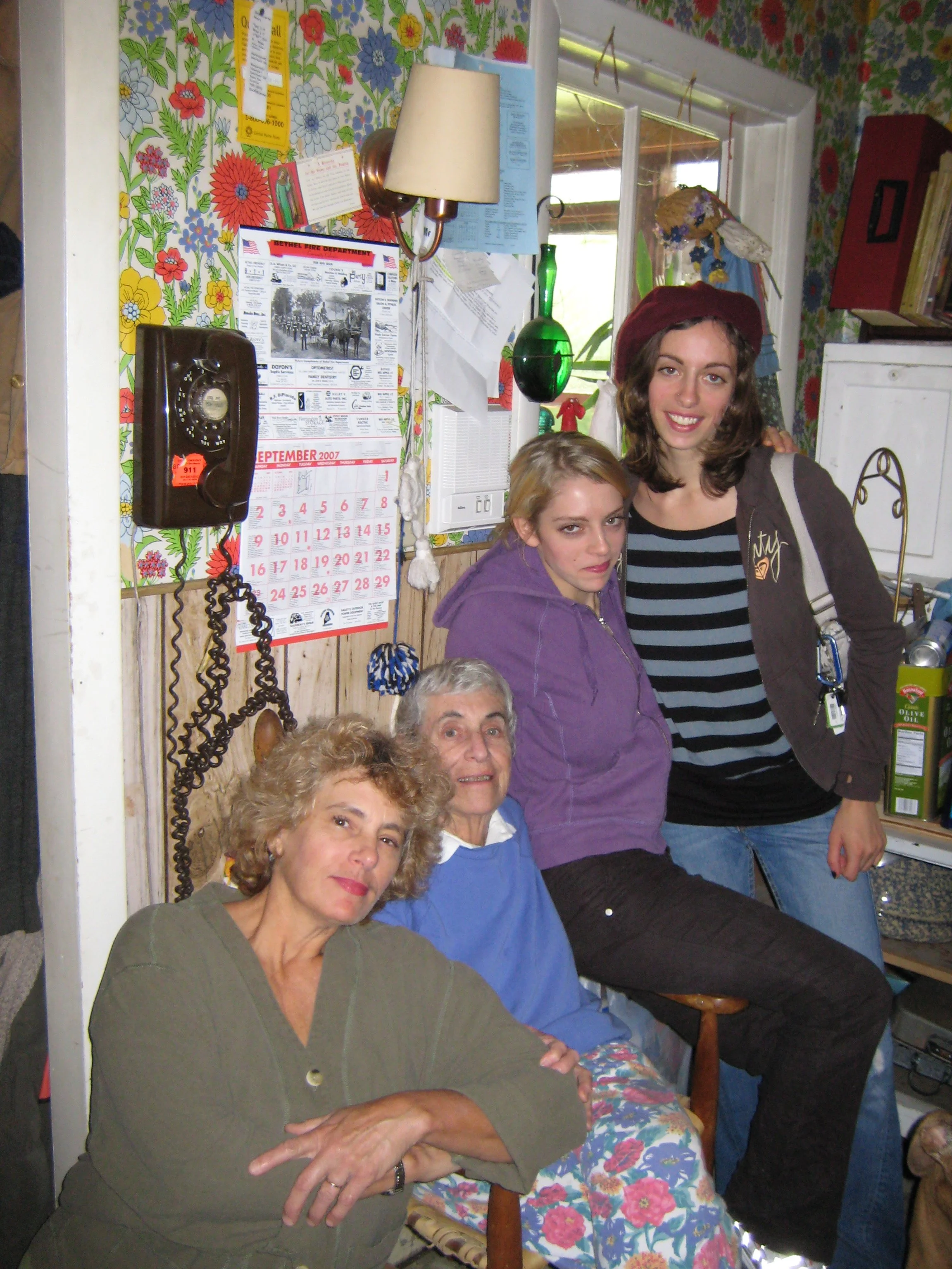
Mom, grandma, sister and me in my aunts kitchen with 70’s original floral wallpaper, 2007
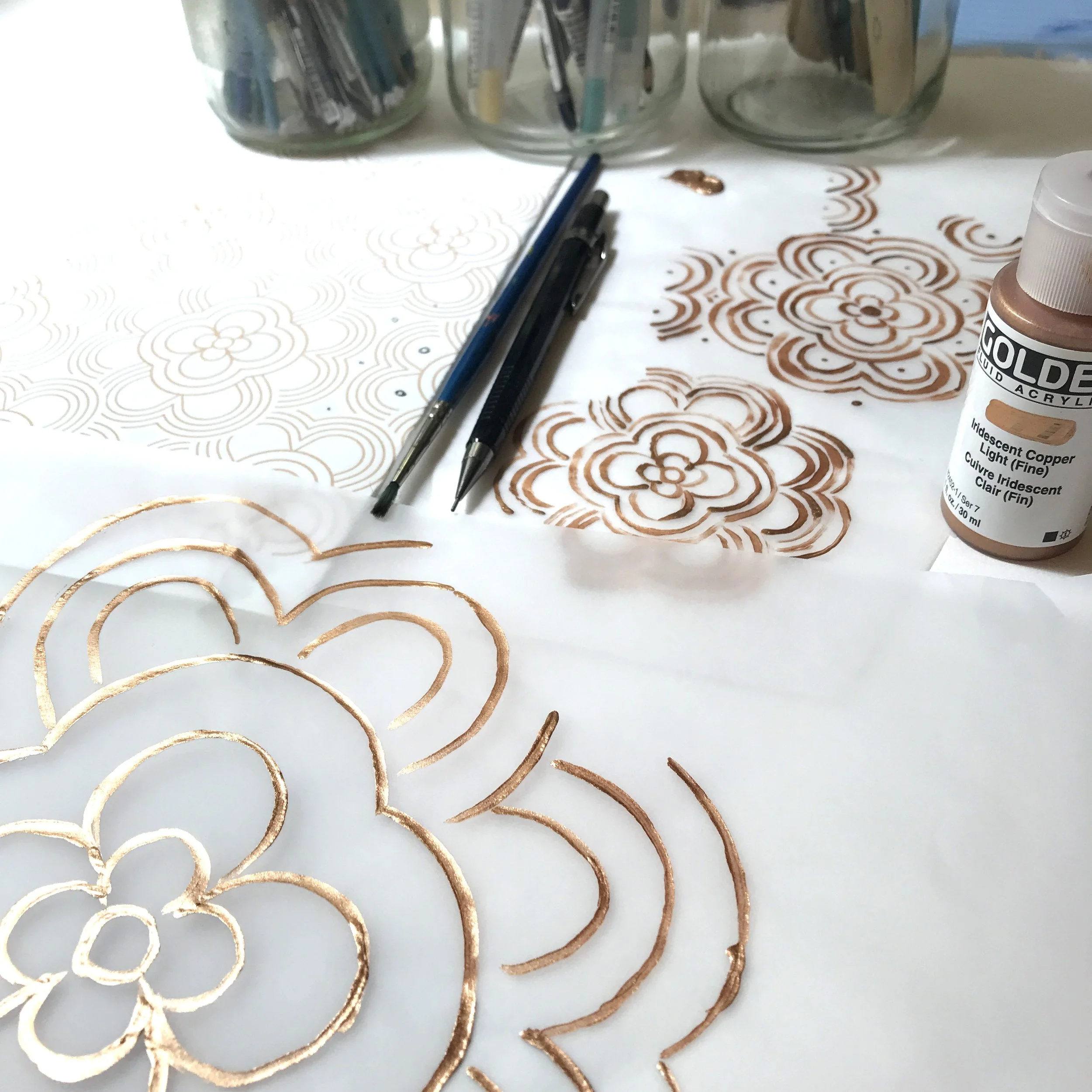
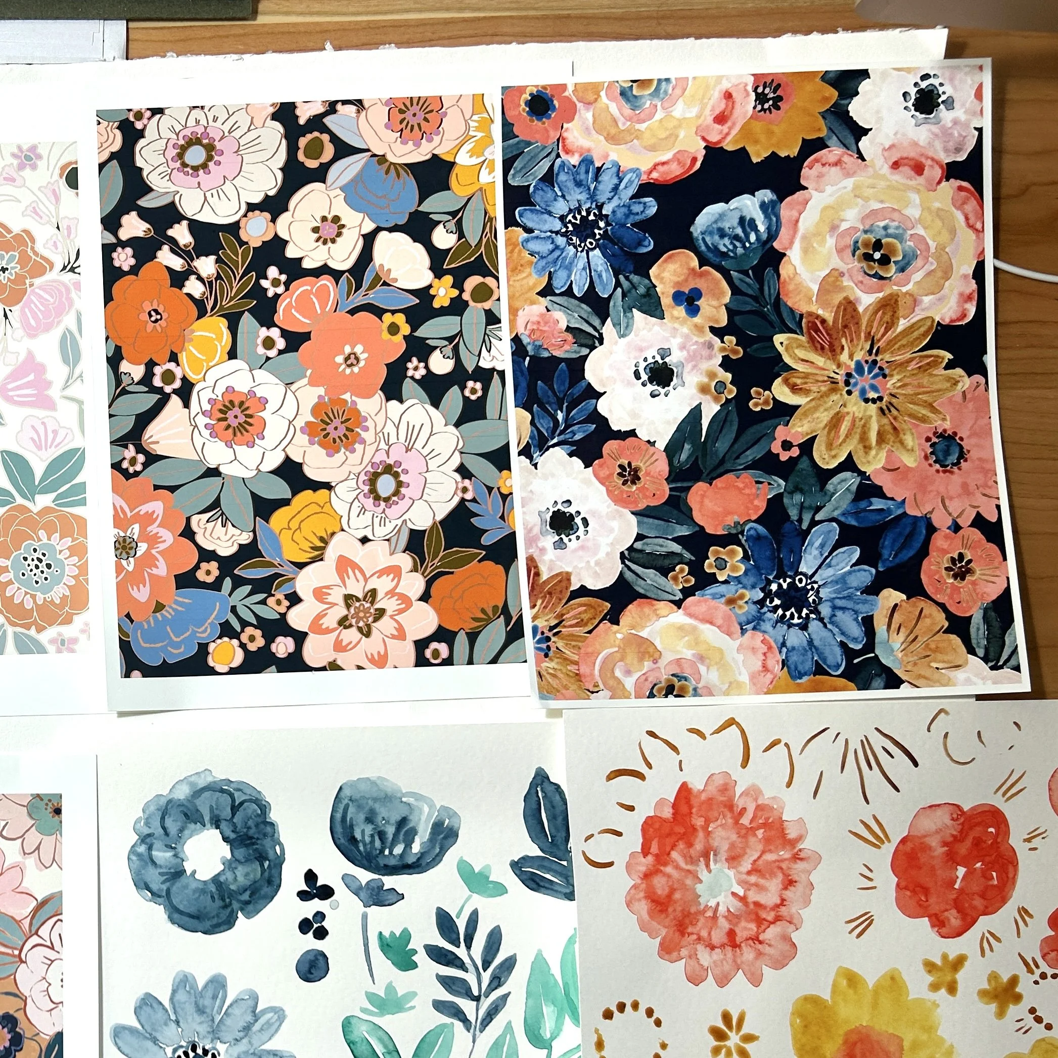
Here are some shots of the collection unfolding. I created florals digitally through Procreate and Adobe Illustrator. Nothing had felt like the right fit despite the months-long experimentation until I returned to hand-painted watercolor and freeness to do it my way. A conversation with my sister reminded me that I didn't have to do anything— this freed me to do it however without the pressure.

Darlene

Devon
Harvest Moon Ditsy

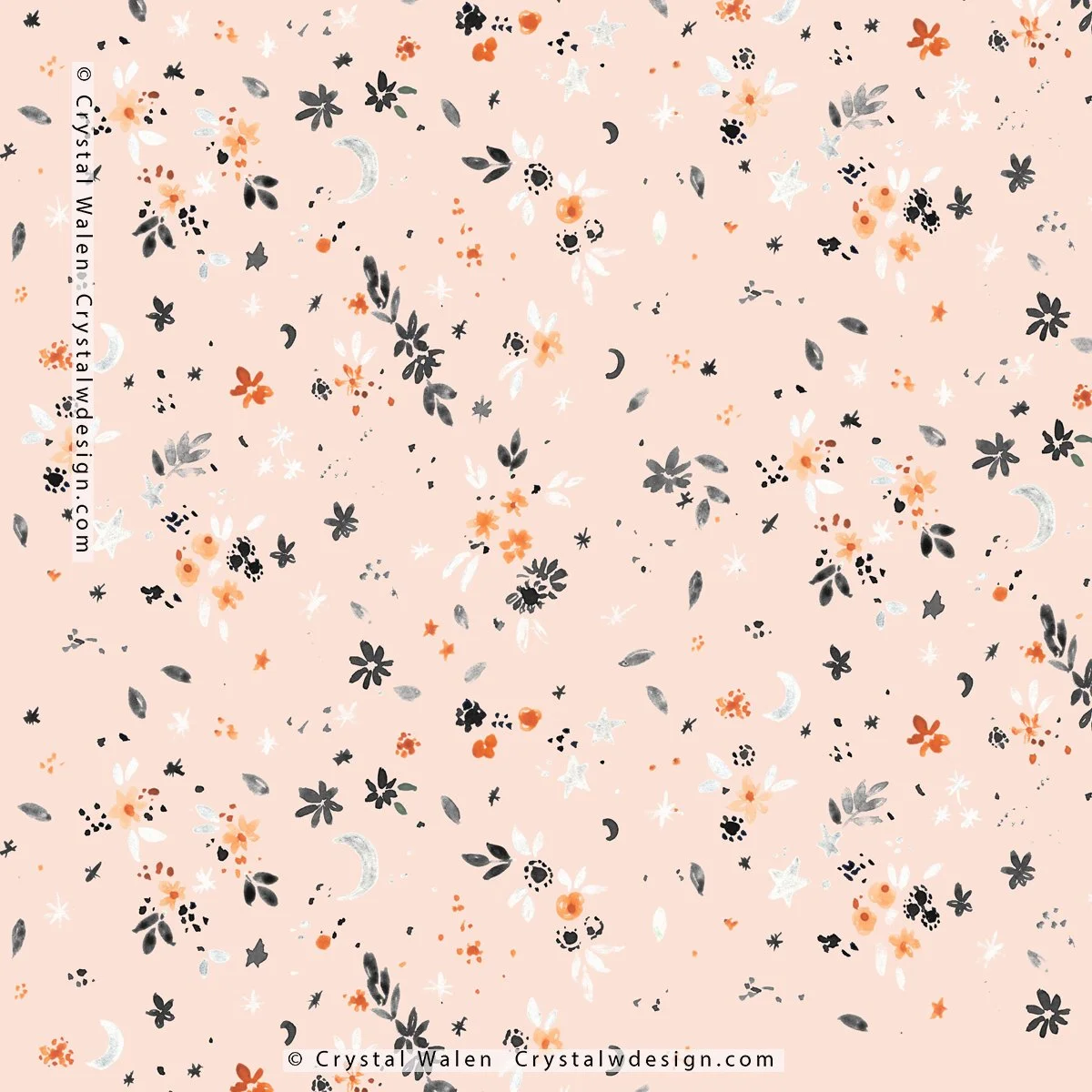
Inky Ditsy

Lana

Woodstock

Lisa

Brown Eyed Suzies

Sabra